In the fast-evolving world of cannabis retail, live menus have become essential tools for engaging customers, showcasing real-time inventory, and driving purchases. But just having a live menu isn’t enough—it has to be designed well. A poorly designed interface can confuse shoppers, increase bounce rates, and damage brand trust. So, what exactly separates a successful live menu from a failed one?
What Works: Design That Drives Engagement
1. Clear Categorization and Filters
Users want to find what they’re looking for—fast. Live menus that succeed typically start with intuitive categories like flower, vapes, edibles, and concentrates, followed by easy-to-use filters for strain type, THC/CBD percentages, and price range. If customers can sort products based on their preferences, they’ll spend more time browsing—and buying.
2. Real-Time Inventory Accuracy
Accuracy isn’t flashy, but it’s powerful. Customers lose confidence quickly when they see an item listed as “in stock,” only to find it unavailable at checkout. A great live menu syncs in real time with your POS system, eliminating errors and ensuring inventory data is always up-to-date.
3. Clean Visual Hierarchy
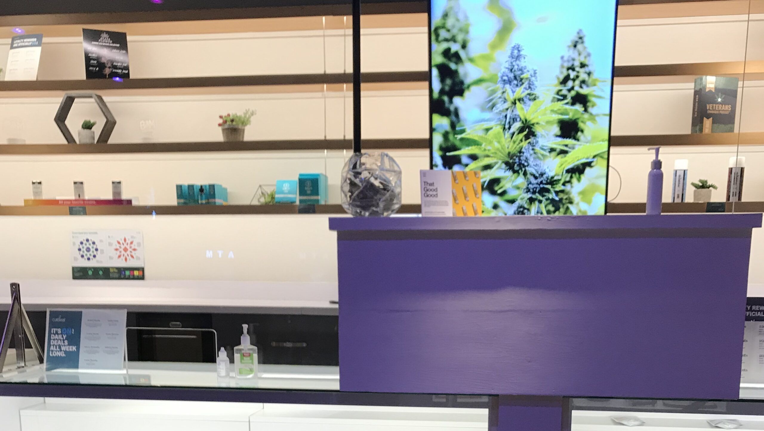
The best menus guide the eye. This means using consistent fonts, proper spacing, and clear calls to action like “Add to Cart” or “Learn More.” High-resolution product images, strain info, and prices should be easy to digest at a glance.
4. Mobile Optimization
Mobile-first design isn’t optional anymore. Many cannabis shoppers browse menus on their phones before ever setting foot in a dispensary. A responsive, swipe-friendly interface with fast loading times dramatically increases conversions.
5. Personalization
A smart live menu tailors itself to user behavior. Whether through saved preferences, recommended products, or “Recently Viewed” sections, personalization encourages repeat engagement and builds a sense of connection between customer and brand.
What Fails: Common UX Mistakes
1. Cluttered Layouts
Overcrowding a page with too many colors, icons, or banners overwhelms users. If your menu looks more like a digital circus than a curated shopping experience, expect frustration and high exit rates.
2. Poor Navigation
Menus without clear labeling, logical flow, or breadcrumbs leave users guessing how to move between categories or return to previous pages. If shoppers get lost, you lose sales.
3. Inconsistent Product Information
Nothing hurts credibility more than inaccurate or incomplete product data. Missing lab results, inconsistent pricing, or vague strain descriptions can make your live menu feel unreliable—especially in a highly regulated market.
4. Slow Load Times
Live menus with slow rendering kill momentum. Cannabis consumers expect immediacy; if your menu takes longer than a few seconds to load, your competition is one tab away.
5. Lack of Accessibility Features
Ignoring accessibility limits your customer base. Failing to include alt text for images, keyboard navigation, or readable font sizes leaves users with disabilities behind—a missed opportunity and potential legal liability.
Conclusion: The Menu Is the Message
Your live menu isn’t just a tool—it’s a digital extension of your brand. If it’s intuitive, accurate, and engaging, it builds trust and encourages loyalty. But if it’s clunky, confusing, or inaccurate, it drives potential customers straight to the competition. By understanding what works and avoiding what fails, cannabis retailers can create seamless, user-friendly experiences that convert browsers into buyers—every time.